Welcome to the second review in my Printify print provider reviews, this week we’re taking a look at SwiftPOD. SwitfPOD are based in the US, and print exclusively on clothing.
If you’d prefer to watch this review, please take a look at the video below, if not please carry on reading after the video.
The Test
The test is quite simple, I basically placed an order with SwiftPOD/Printify for both a black and white t-shirt containing my print test design. Both shirts are the same model, Bella Canvas 3001, in size large.
The design consists of a challenging white photo. I chose this photo because it contains lots of subtle shades of white that can be difficult to print. The same goes for the dark photo. Lots of different shades of black and other dark colors that can be hard to print accurately especially on fabric.
The rest of the test design is just different shades of colors, print alignment test, font size tests and another challenging photo that contains lots of vibrant, contrasting colors.
SwiftPOD Review
Processing Time
I placed my order with SwiftPOD on Aug 30th and my order shipped on Sep 1st, so just two days production.
Which is pretty fast, however I must say that in my experience with swift, their production times seem to vary a lot. Sometimes an order will go out really quick, and then sometimes an order will take like 4 days.
When running a business consistency is key, if you can’t accurately give customers an estimated delivery date. Then you should expect to lose business or end up with a few unhappy customers.
Delivery Time
I live in the UK so my delivery time will always be longer than for a US order. However, delivery only took two weeks. Which is the same as with monster digital.
My order was shipped on the 1st of September and was at my home on September the 15th. For US orders they use USPS, which seems to take about 5 business days on average from my experience.
Packaging
The packaging was nothing fancy, Its just a standard plastic, non recyclable bag. I’m not sure if this is just standard in the US, maybe someone can let me know in the comments. I don’t if in the UK and Europe theres more of a demand for recyclable packaging. Maybe its just who I order from, but most items that I get delivered either come in carboard boxes or paper bags nowadays.
Pricing
At the time of purchase the shirts were around $7.69 each. They have recently put the prices up. With prices ranging from $7.64 all the way up to $14 per shirt. This is the pricing with an active Printify subscription. I do find their pricing structure to be quiet odd, every size and every color seems to have a slightly different price. Which then makes it more difficult for you to price your items properly.
Initial Impression
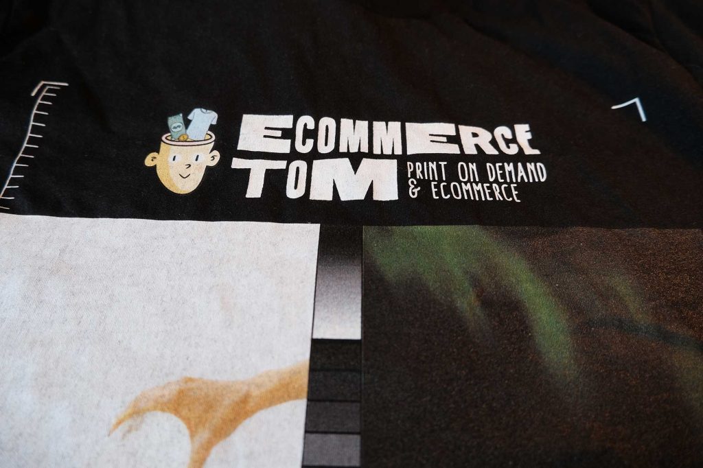
– My initial impression was slightly negative, especially on the white print on the black shirt. It just looked super patchy. However all the colors seemed good, and everything looked crisp and full of detail.
– After looking at the print for longer, and comparing to monster digital. I can definitely see that swifts print is slightly less saturated, but that’s not a negative, the colors look more real and true to life.
– Another thing I noticed is that swifts print is super sharp and crisp, all the fine lines have printed well with no blurriness at the edges.
– Overall I’m really liking Swifts print, so lets get into the details.
Print Size
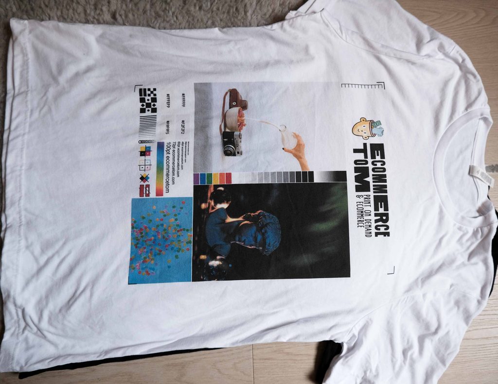
On the printify website, the print area for Swift seems a lot smaller than some of the other print providers. The size of the print area is 3692 × 4800 px for swift, compared to Monster Digital which is 4500 × 5100 px.
I thought this would be a lot of a bigger deal in real life, since the difference looks quite large on the website. However, the size of the print in real life is perfectly fine and isn’t as small as the printify mockup makes it out to be.
Don’t get me wrong, it is still a smaller print area, however I don’t think this should put you off using Swift, the print area is perfectly adequate for most designs.
Dark Print
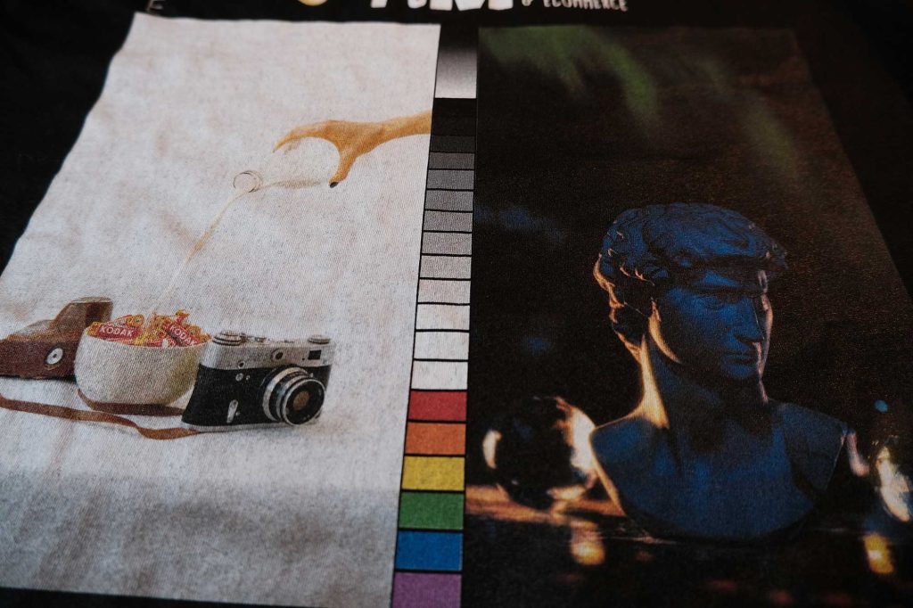
We’ll start with the dark print on the white shirt. I’m super impressed with the print on the white shirt. Everything has printed great, and especially the dark photo. All the detail in the photo is still there, even right down to the facial features of the statue.
Looking a the dark print on the black shirt. The difference between the prints on the black and white shirt are minimal, the only difference is that the colors on the black shirt are slightly puncher. They both seem to have the same level of detail.
White Print
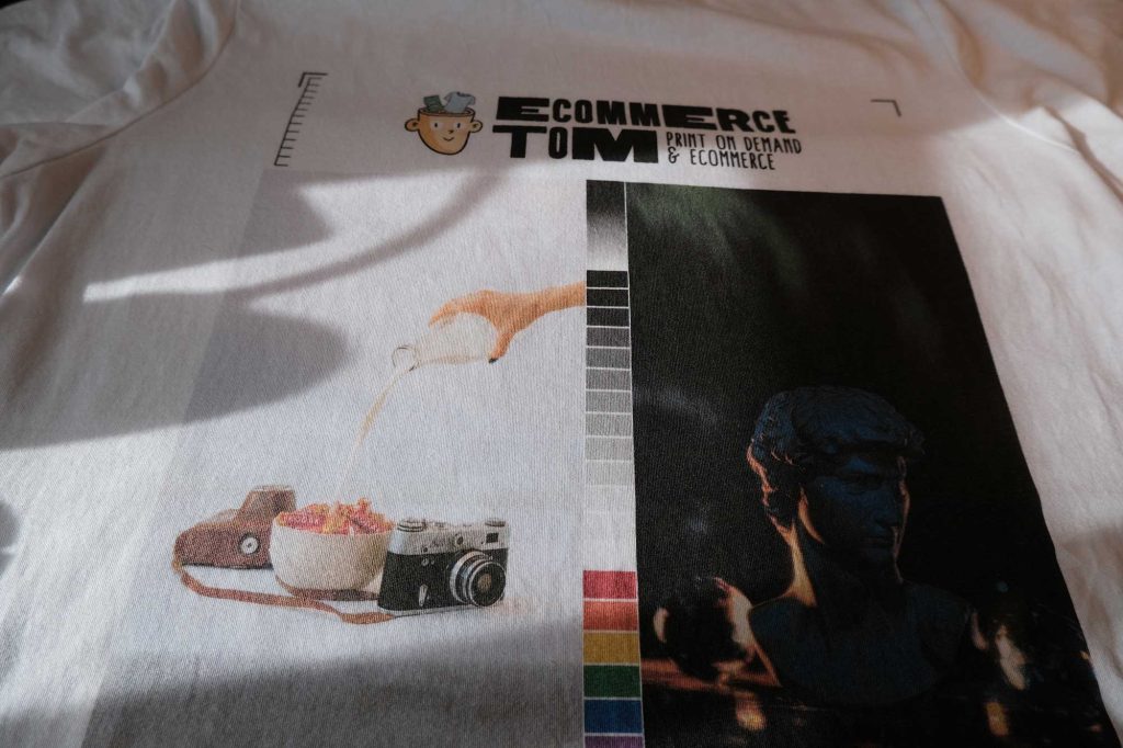
Moving on to the whites on the white shirt. This photo has printed out perfectly fine, but again the colors seem to be slightly muted, but more true to how the photo actually looks. Some detail has been lost in this photo, this is clear if you look at the hand, all the shadow detail has been lost. But looking at the batteries, the “Kodak” text is still viable and readable.
Looking at the white photo on the black shirt, this is huge negative, it just looks bad. The white print is really patchy, which too much of the black fabric showing through. I would defiantly stay away from print large blocks of white.
I have yet to see a DTG printer that is capable of printing white on black at a high standard. By a high standard, I mean something that is comparable to a screen-print.
Sharpness
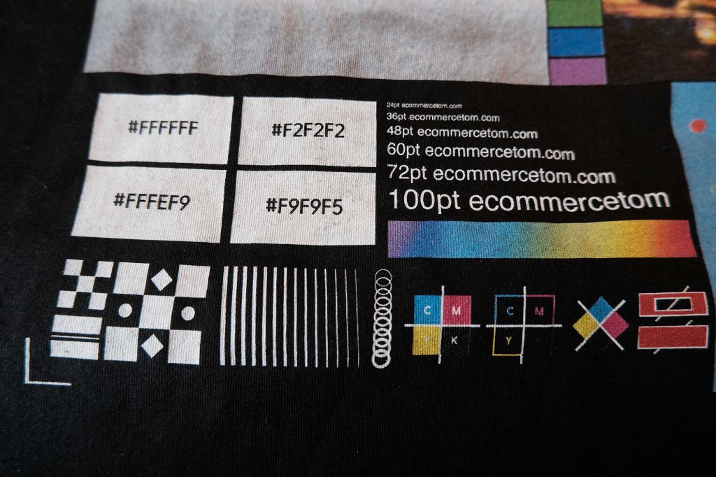
This is were swifts print shines, everything is just super sharp and full of detail. All the text is clearly readable, even right down to the 24pt font. Every single line has printed sharp, even right down to the thinness line. I’m very impressed with the sharpness and level of detail in swifts print.
Taking a look at the alignment icons, you can clearly see how sharp the print is, there is no bleed or edge blurriness that some other printer struggle with.
Vibrancy
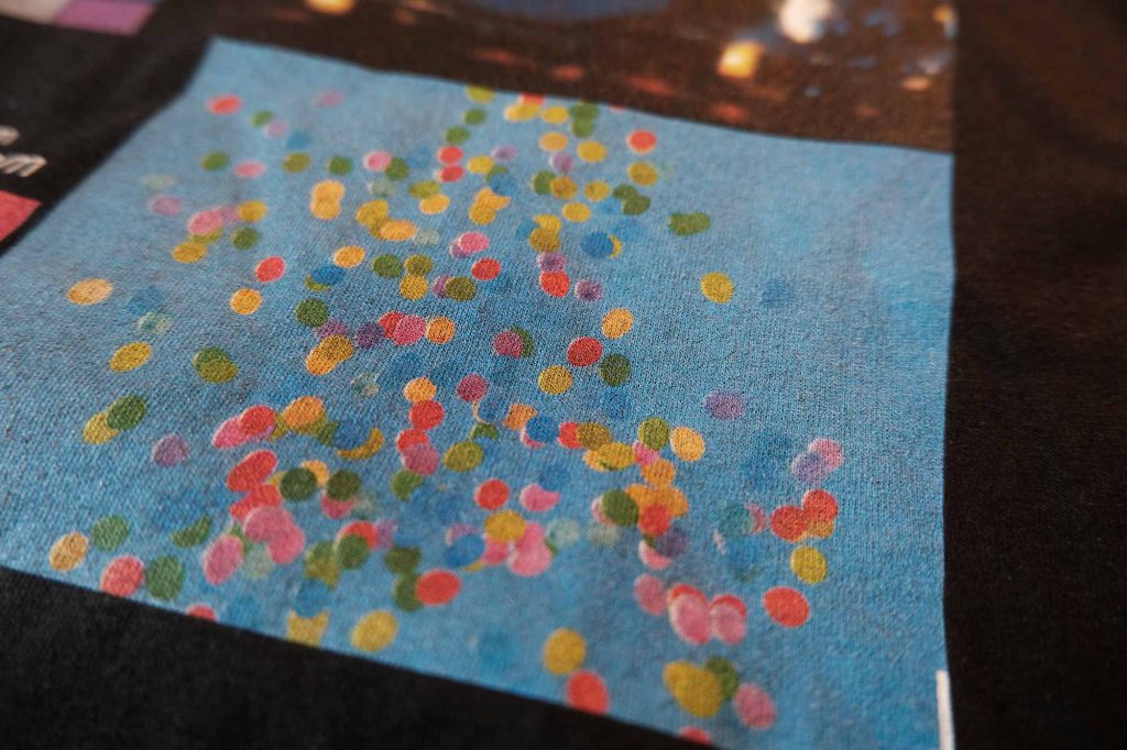
Swift Color vibrancy is definitely more muted and on the less saturated side. But it appears to be more true to how the colors actually look. This can be both a pro and con depending on personal preference and on what designs you do.
This is most evident in the ballon photo. While the print does look bright and vibrant, I can definitely see that is not as saturated as some other providers prints.
Comparing the difference with the print on the different shirts. The colors on the black shirt are slightly darker, but its nothing super noticeable. I’m again impressed with the level of detail that is in this photo, every detail seems to have printed, even down to the subtle shadows on the tiny balloons.
The colors on both shirts seem to have printed pretty accurately and the print doesn’t suffer from any color bleeding or anything like that.
Looking at the color swatches. The colors look accurate on both shirts, no complaints here. And as usual the colors on the white shirt are slightly brighter than on the black shirt – but this is pretty normal with DTG.
White or Off White
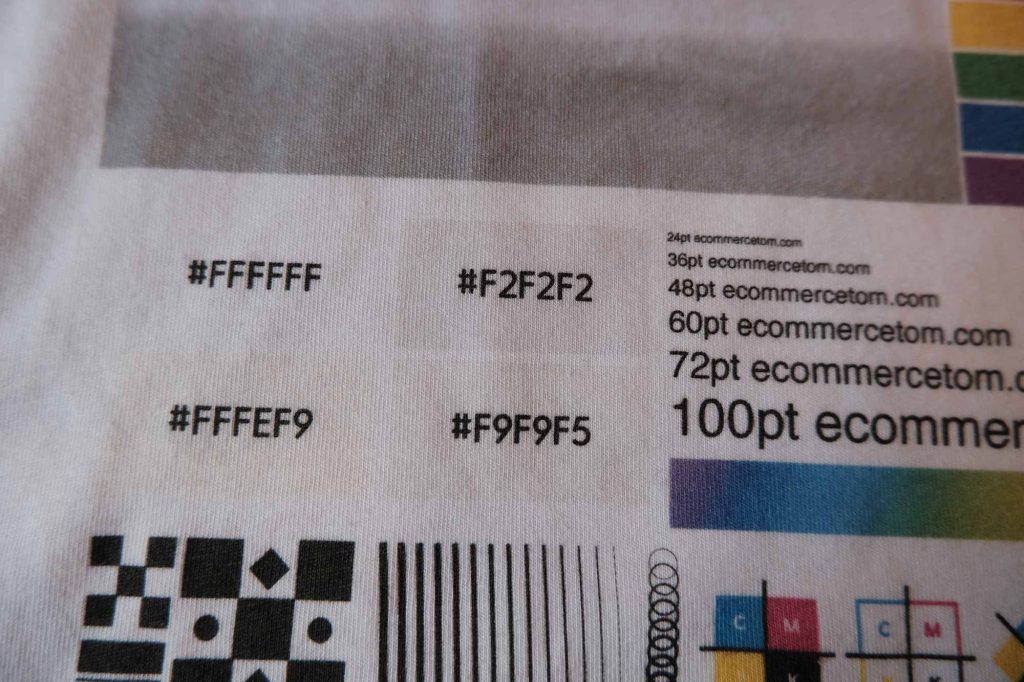
Some people swear that using an off white, instead of true white results in better prints. But I’m just not finding that to be true. Looking at all the off whites on the black shirt, they all just look white, and they are all just as patchy as one another.
So using an off white with swiftpod, really doesn’t seem to effect the final print. The off-whites are only visible on the white shirt.
Print Feel
As expected, the print on the white shirt has no feel to it, it’s just as though the print is part of the fabric. Which is usually the case with DTG prints and makes for a very comfortable wear. On the black shirt however, the feel of the print is very evident. It has a rough texture to touch. This isn’t necessarily a negative, but it is something to be aware of.
Both prints are matt, with the white shirt being the most matt and the black shirt having a slight shine to it. Nothing super noticeable, but something to keep in mind.
After the first wash
I placed both shirts in a cold wash and air dried, just as printify recommends. Both shirts have come out looking perfect, just like they went in. I can’t see any issues with the print coming off. But of course this is only its first wash, we’ll see how it holds up after a few wash cycles.
Conclusion
In conclusion I’m very happy with swifts print, both prints are super detailed and the colors are accurate if not slightly less saturated. Only let down by the white print on the black shirt. I think you’ll find this is the case with all DTG prints. I would just stay away from printing large blocks of white in general.
Moving away from the print quality, their production times were good and so were the shipping times, even to the UK. My only negative with them is their odd pricing, with the same shirt varying from $7 all the way up to $14 depending on the color or size, this just makes it hard to price your items and maintain a healthy profit.
If you can get past their odd pricing and the slightly smaller print area, I think swift offer great print quality and good production times. However if color vibrancy is the most important factor for you, then I would consider looking elsewhere.
In my next review, I will be comparing them to Monster digital, so consider subscribing to my Youtube channel or newsletter if you’re not already, so you don’t miss out on that.
In Other News
I had a few requests for me to make the print test files public for other people to use, and I have done just that. They are all available to download here. Another exciting addition to this website is my Etsy Profit Calculator, which allows you to accurately estimate your expected profit minus all Etsy fees. I developed this from scratch, mainly for personal use but have decided to make it public.
See you next time! -Tom



0 Comments for “Printify: SwiftPOD Review”