Welcome to the third review in my Printify print provider reviews, this week we’re taking a look at The Dream Junction who are a Printify Print Provider. The Dream Junction are based in the US, and print exclusively on clothing.
If you’d prefer to watch this review, please take a look at the video below, if not please carry on reading below the video.
The Dream Junction Review
The Test
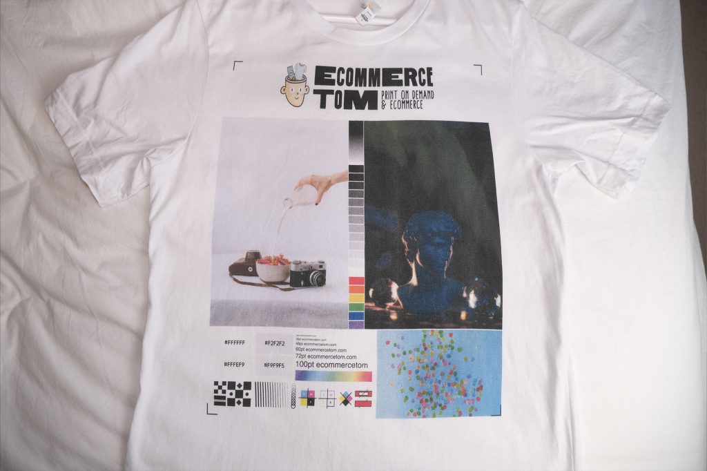
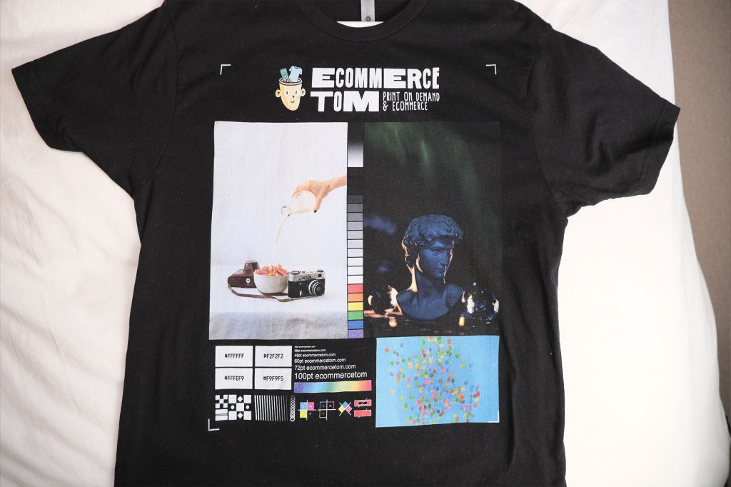
The test is quite simple, I basically placed an order with The Dream Junction/Printify for both a black and white t-shirt containing my print test design. Both shirts are the same model, Bella Canvas 3001, in size large.
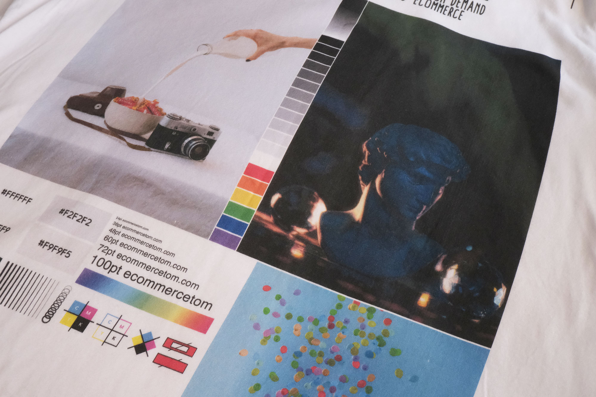
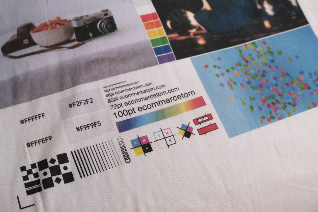
The design consists of a challenging white photo. I chose this photo because it contains lots of subtle shades of white that can be difficult to print. The same goes for the dark photo. Lots of different shades of black and other dark colors that can be hard to print accurately especially on fabric.
The rest of the test design is just different shades of colors, print alignment test, font size tests and another challenging photo that contains lots of vibrant, contrasting colors.
Production and Shipping Times
First lets talk about the processing and shipping times. I placed my order with The Dream Junction on the 8th of February, the order was then shipped on the 10th of February, so that’s just three days production time which is pretty good! I live in the UK so my shipping times will be longer since The Dream Junction are based in the US. However, I was very impressed with the delivery speed, it took just 7 days for my order to reach me.
Regarding the packaging, the shirts just came in a plastic bag, nothing fancy. None of the labels stated “Printify” or The Dream Junction. Instead it displayed my company name.
Pricing
Moving on to the pricing, each shirt cost me $8.60 with UK shipping costing $14. If I was based in the US, my shipping costs would have been $6.
For profit margins, if you were to charge $24 for a shirt to a customer with free shipping, with the Dream Junction, you would be looking at around $11 profit, not taking into account any marketplace fees, sales tax or anything like that.
| Prices for a US customer | The Dream Junction (Printify) | Monster Digital (Printify) |
|---|---|---|
| Bella Canvas 3001 (Black, L) | $8.60 | $8.57 |
| Shipping cost to the US | $4 | $4 |
| TOTAL COST | $12.60 | $12.57 |
Wrong Shirt
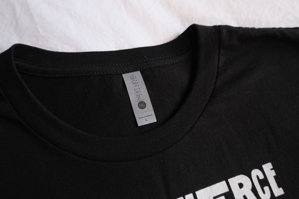
Moving on to the shirts, the first thing I notice when I open the package is that the black shirt isn’t actually the bella canvas 3001 like I ordered. Instead it’s a Next Level shirt. So not a great start. But to be fair, this is a more expensive shirt coming in at just over $11 with the dream junction, so at least they haven’t sent a cheaper/lower quality shirt. But this is a Men’s fit shirt, with the sleeve fitting a little different and the shirt length being shorter.
I’m not sure if this was just a mistake, or do they substitute brands when they run out of stock. Either way, I’m not sure how I feel about this, on one hand if an item is out of stock and substituting reduces any delays to the order, then I can understand why they do it, but on the other hand, it is a different shirt. I suppose it would only be an issue if the customer was expecting a Bella Canvas tee and then received this. Quality wise the shirts are comparable, with the next level being a little softer surprisingly.
Print Quality – White Shirt
Now lets take a look at the actual print quality, starting with the white shirt.
White Print
Looking at the white print, this has printed overall pretty good but I can see that a small chunk is missing, I think a bit of loose fabric must have been there when the image was being printed. Another thing I noticed is that the print is overall pretty dark, while everything is still visible, the image looks like it has a blue/grey cast over it. This is not a massive issue though.
Dark Print
Moving onto the dark print, this suffers the same issue, in fact the whole print suffers this issue. Its just printed pretty dark, while you can generally still make the image out, some of the detail has gone. Look at the statues face, the shadows around its face are barely visible. If a customer was to receive this print, then I’m not sure that they would be able to tell that the shirt was printed dark, it isn’t that dramatic. But because I have the original print file, and the same design printed by other companies, I can see the difference.
Another issue I can see, and I’m not 100% sure if the camera will pick this up, is that theres lines running down the image. Almost like the printer was running out of ink. Its subtle, but its there.
Colors
Looking at the colors, everything does look vibrant, but everything does have that slightly grey blue cast making everything look a little darker than it should be. Looking at the balloon photo, again theres another little chunk missing. This time there was little piece of fabric there, that when brushed away took the print with it. One good thing I have noticed regarding the colors, is that the blacks are really black. This is making me think that they have their printers optimized for just simple designs, simple text based designs, or simple illustrations.
Whites
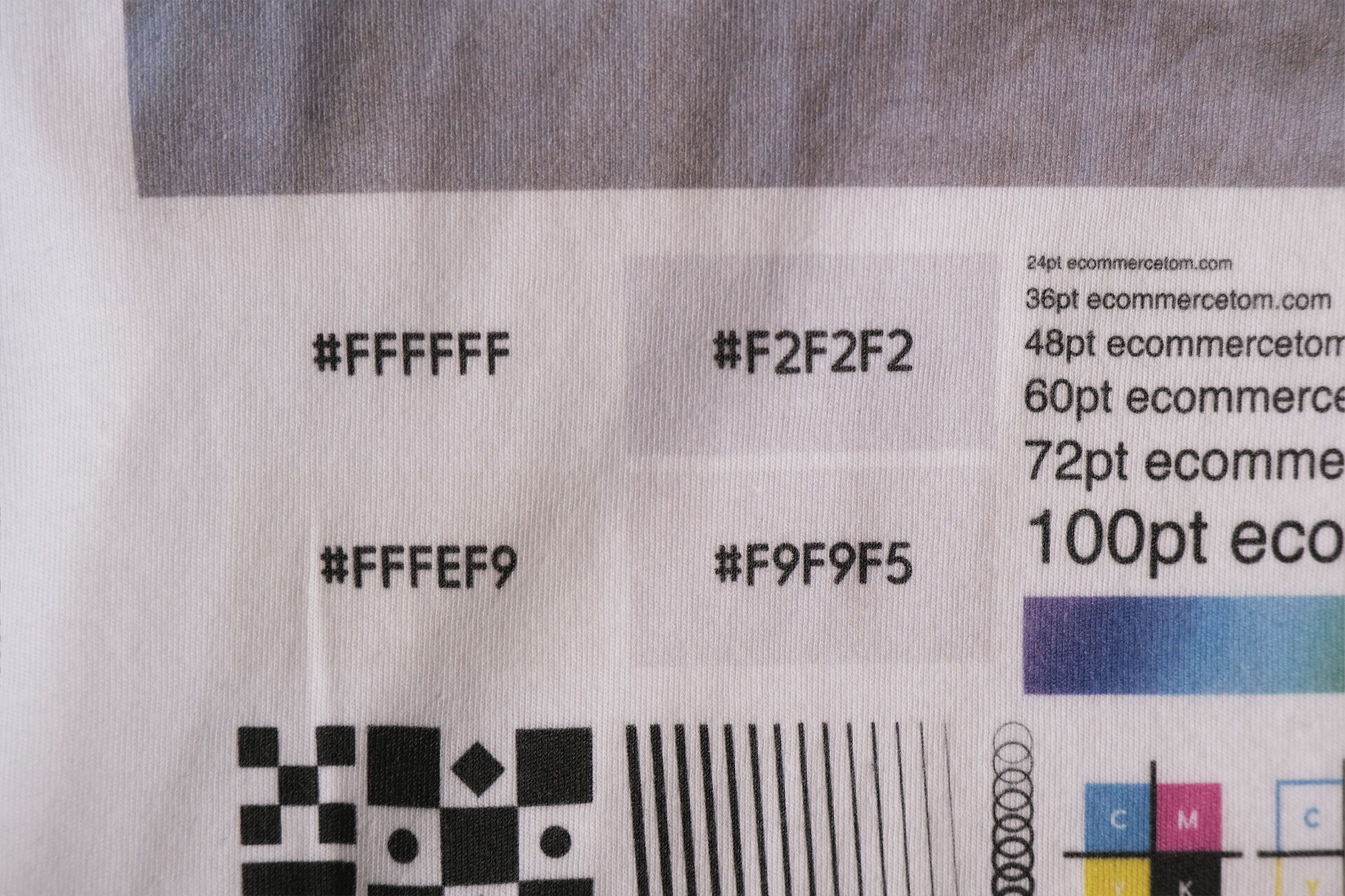
Looking at the different shades of white now, and this really shows that The Dream Junction’s print process has made everything dark. The differences between each off white is very dramatic, when in reality they’re just slight variations of white.
Now taking a look at the alignment icons, everything has printed well. Everything is super sharp, even right down to the smallest text and thinest lines. This is definitely one of the sharpest prints I’ve seen. No blurriness at all.
Print Quality – Black Shirt
Okay, moving onto the black shirt. Overall this has printed well and doesn’t have the dark cast that the white shirt has.
Looking at the white print first, its a little patchy. But I’ve come to expect this with DTG printing. However I can see that the patchiness is in lines up and down the photo. Similar to the issue on the white shirt. Looking at this from a short distance the print looks fine. In fact if we look at the white text, this looks great! The white is really crisp and bright and makes the text stand out. I’m just confused at how the text looks great, but the white photos looks a little rough.
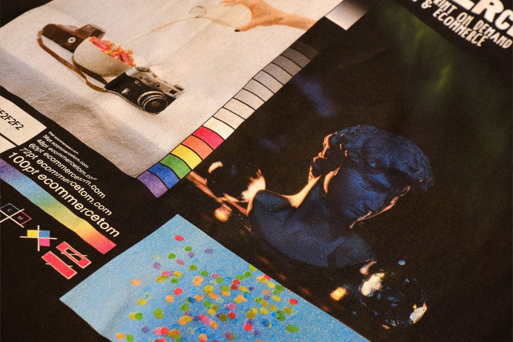
So looking at the dark photo now, while this does look slightly darker than the actual photo, I do actually like how this has printed. The details of the photo are still visible, with the blacks being so deep, it makes the statue really pop. I’m actually very happy with how this photo has turned out.
Color
Moving onto the color, everything looks nice and vibrant. But if we take a look at the balloon photo, this looks patchy, we can see the white undercoat. This is the same if we look at the gradient strip. But this is only visible closeup, from a short distance, you can’t see this. Looking at the off whites, the difference between the colors here is much more subtle than what they look like on the white shirt. Generally they all look white, none of them look any better than just using white. In fact I think the F2 white looks slightly worse than the others.
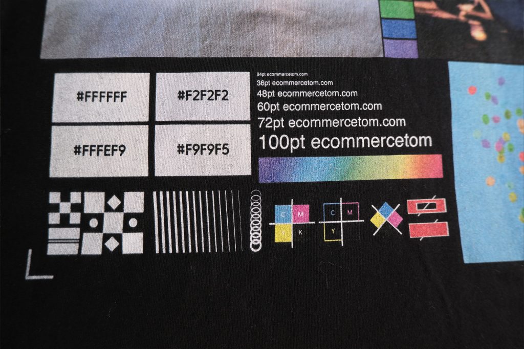
Looking at the alignment sections, again everything is very sharp, all the text has printed and all the lines have too. Very happy with this. Another good thing I’ve noticed is that there is no white border to anything. Sometimes with DTG printing on the dark fabrics, the prints sometimes have a white border if things aren’t lined up properly when the image is being printed. However this is not present here.
Overall I do prefer how the print has turned out on the black shirt, it looks pretty good, its just how the white photo looks that lets this print down slightly. The print on the white shirt is not bad by any means, I can just see that its clearly darker than it should be and everything has blue tint to it, again, from a short distance the prints overall looks pretty good.
Print Look and Feel
So looking at how the prints look and feel. On the white shirt, the print is matt and feels like it part of the fabric. But this is pretty normal for DTG. Looking at the black shirt, the print definitely has a feel to it. But it feels a lot less prominent that other prints I’ve seen. The print on the black shirt is also very matt, sometimes the prints on dark fabrics have a little shine to them. Thats not the case here. Personally, I prefer the prints being matt as it makes the prints look part of the fabric, instead of just sitting on top.
Conclusion
Over all these prints are good, I did find a few small issues, but they aren’t a deal breaker. Both shirts have some good qualities and a few small issues. I do think that if you have simple designs, for example just text based designs, with maybe some simple graphics, then The Dream Junction would be work well for you. Its when we look at the photos, they just don’t seem to have printed that amazing, with the exception of the dark photo on the black shirt.
I do personally use The Dream Junction as a backup for when items with Monster Digital are out of stock. And seeing this test print today isn’t going to change that, I knew they had good print quality, and I haven’t received any complains from customers. But saying that, they have sent me the wrong shirt, the shirt being a mens fit shirt. Now that does have me a little concerned as most of my customers are female.
Saying all this, my opinion as far as Printify goes, is that Monster Digital still offer a slightly better print quality. Monster Digital are who I use as my main printer, with The Dream Junction being the backup. However being honest, the more a look at this print overall, the more I like it. In fact I’m starting to prefer how this print looks over Monster Digtial’s. I’ll have to do more print tests with my actual designs, before I make any decisions.
Printify Rankings
Since I’ve now reviewed three Printify print providers, I can now start ranking them in order of best to worse. Now there’s nothing scientific about these ranking, its just my personal opinion, and this will most likely change overtime. Out of the providers I have reviewed, I still rank Monster digital as number 1, however the wash test for Monster Digital has me a little concerned. Closely followed by The Dream Junction at number 2, and that leaves Number three being SwiftPOD.
| Printify Print Provider | Recommend? |
|---|---|
| 1) Monster Digital | 👍 |
| 2) The Dream Junction | 👍 |
| 3) SwiftPOD | 👍 |
After Washing
I washed both shirts in a cold wash, and air dried. The black shirt has come out looking exactly as it went in, which is very good. However the white shirt has faded slightly, this is only sightly and doesn’t have be concerned yet.
Of course this is only one wash, I’ll continue washing these shirts and they will be included in a wash update video in the future.
Next we’ll be taking a look at FYBY. Subscribe to my Youtube or Newsletter so you don’t miss out on that.
If you’re not already signed up to Printify, consider supporting my work by using my link to sign up.
See you next time! -Tom


0 Comments for “Printify: The Dream Junction Review”